
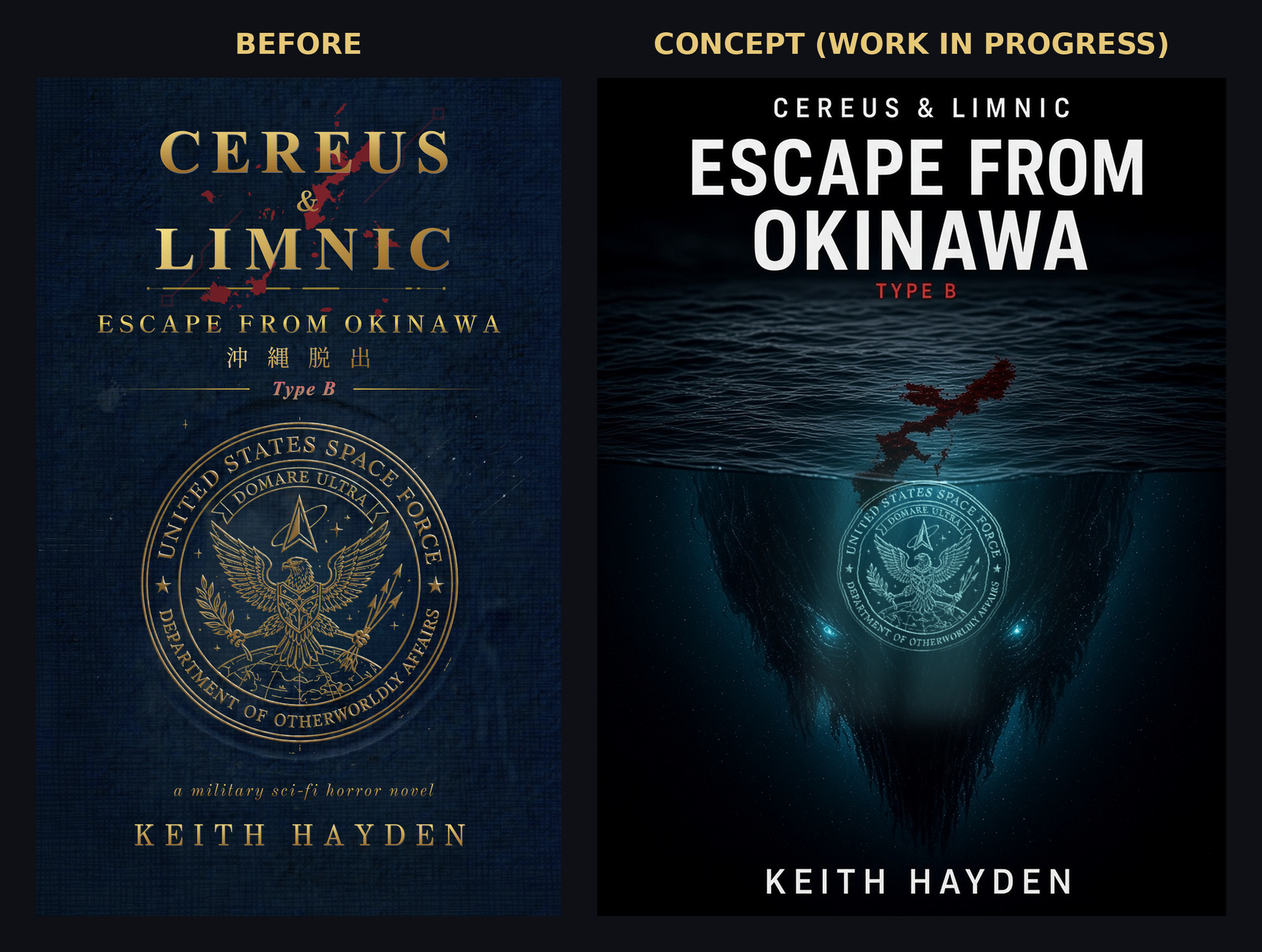
Last week in early November 2026, I revealed the cover for Cereus & Limnic: Escape From Okinawa | Type B. I made it myself.
The same week, I put out a Novel Revealed! episode called "How to Make Book Covers." In it, I said something I still stand by: I'm no expert at cover design, but I'm not a beginner either. I've made a lot of my own covers. I've got an instinct for design. It's just not where I spend most of my time.
Then I went to Author Nation in Las Vegas and sat in a book cover class.
And I thought… oh no.

What I made
Here's the cover I revealed. A navy, passport-style look. A gold serif title. The kanji. My Department of Otherworldly Affairs seal right in the middle. And notice that red splatter? It's not random. It's a map of Okinawa, in blood.
I love this cover. Every piece of it means something to me.
That's the problem.
It's not a bad cover. But it's a cover for me, not for readers.
Lesson one: shrink it and compare it
The first big lesson from the class was simple: look at your cover at small size, next to high-performing books in your genre.
Here's how I put it in a voice memo I recorded in my car right after the session:
"Most people encounter your cover, it's on a small Amazon page or a website page. You're trying to get them to click in among this endless scroll of millions and millions of books, and that is very difficult."
You want it readable. You want it to look like it belongs.
"You can do whatever you want with your cover, obviously, but you can't be surprised if you don't get people interested in your book if your cover looks completely different from the expectation that readers have."
I know that. I learned it years ago. And still:
"Doing that comparison is something that I hadn't been doing. And I definitely did not do that at all last week."
I didn't do any Amazon comparison tests or checks on Goodreads. I made it in a vacuum of my own preferences and obsessions. I never put it side by side with what's selling. According to the class, that's a quick way to create a cover that doesn't get noticed, which means the book doesn't get read.
Lesson two: the cover isn't for you
This is the biggest reminder that stuck with me.
"The cover is not for you as the writer. The cover is for the reader. It's like putting clear signage in a store. You can have a beautiful sign, but if people can't understand it very easily or read it, then it's a bad sign. And it's very similar with covers. Covers are signs and signals. They signal emotion, they signal vibes, they signal genre. And if you're not doing that well, then your cover is probably ineffective."
My cover is full of signals. But you'd have to already know the story to read most of them. A stranger scrolling past at thumbnail size doesn't know what the Department of Otherworldly Affairs is. They likely don't know what the entire Ryukyu island chain looks like. They just see a small, busy, dark rectangle.
Trends move, too
The class also showed how fast cover trends change. Take romance in 2015 versus 2025:
"Back in 2015, what was hot? Fifty Shades, right? … Photorealistic covers, eight-pack abs dude, no shirt, arm wrapped around a girl, that type of thing."
And now:
"Much more colorful, brighter color palettes, more cartoon style imagery. It's not photorealistic anymore. That's not what's selling."
What changed? The rise of online influence like BookTok on what gets bought, read, and optioned.
The instructor showed thriller and military thriller covers too. And Escape From Okinawa does lean thriller, even though I market it as military sci-fi horror.
Looking at mine, I could see things to clean up. The title is long, and the way I arranged it is not bad, but I know it could be bigger.
My name could probably be bigger too. I've always kept my names small because I build around one central image. I've done well not making covers too busy. But bigger type reads better at thumbnail size. Period.
Everybody judges
I had this thought in my post class memo:
"It is people's first impression to the book, and whether we like it or not, it's the classic adage, right? Everybody judges a book by its cover. And they tell you not to, but everybody fucking does it. With books, with people, with everything. And so you want to make that first impression as strong as possible."
So here's the rough rework
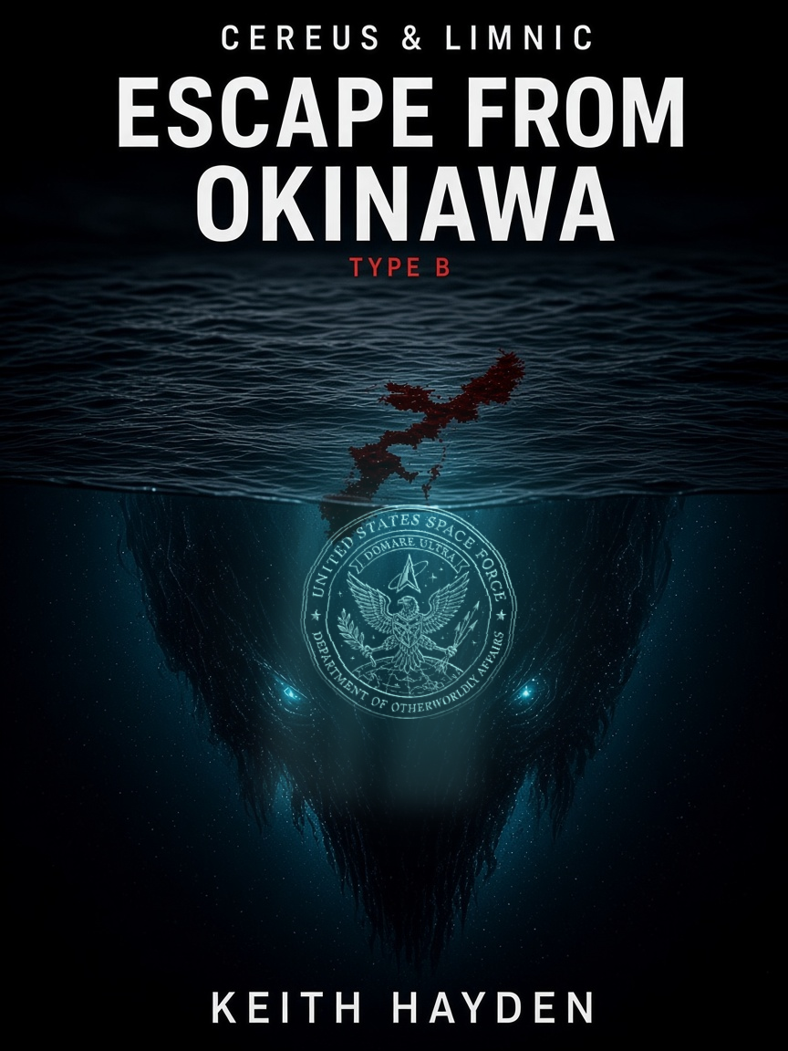
This is a rough concept. I like that it hints at the monster beneath the entire story and easily reads as horror at a glance. The title is also easier to read. I've still got a lot of tweaks to make to it before it's ready.
What I kept:
- The seal. It's a huge piece of this book. It stays, with the full Department of Otherworldly Affairs text visible.
- The blood-map Okinawa. Still there. Still intentional.
What changed:
- The seal goes underwater. It glows beneath the island, with something lurking below it. That's the creeping threat this book is about, and it reads as horror at a glance.
- ESCAPE FROM OKINAWA is the title now. It's bigger, more dominant, and much more readable at thumbnail size.
Why am I going through the hassle of redoing my cover? Because I want to do a better job at helping readers (potentially you!) understand if my book is what you want to spend your time with.
So it's back to the lab to dial it in. I'll share the final when it's done.
Your turn
Which one would you click? The original, or the concept? Let me know! I'd rather hear it now than after launch.
- Read the Type B preview: Cereus & Limnic: Escape From Okinawa | Type B
- Hear how I make covers (and where I admitted I'm no expert): Novel Revealed! — How to Make Book Covers