
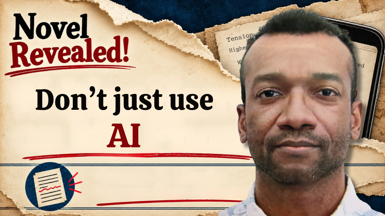
Clip (1 min)
Full video (20 mins)
As an independent author, you already know the harsh truth: readers absolutely judge a book by its cover. In the latest episode of Novel Revealed, I pull back the curtain on my own design process, breaking down how I build covers that capture attention and clearly communicate genre.
Here is a look at how I’m approaching the cover design for my upcoming military sci-fi horror novel, Cereus & Limnic: Escape From Okinawa - Type B.
Why Pure AI Covers Fail
It’s tempting to generate an image, drop some text over it, and hit publish. But pure AI covers consistently fail to communicate the soul of your story. Their overly stuffed, glossy approximations of your title distract from the main message. Furthermore, they lack the specific nuance, layered depth, and structural conventions that a professional book cover requires to effectively signal its genre to readers.
Instead of relying solely on generated images, the real work happens during layering and editing. Using software like Canva, you can take raw visual assets and composite them, applying filters, overlays, and typography until you have a cohesive, unique cover that actually fits your narrative.
Communicating Genre & The Thumbnail Test
Your cover has one primary job: telling the reader exactly what kind of story they are about to experience in a fraction of a second.
Whether a reader is scrolling on a mobile app or browsing your direct Payhip store, your cover must pass the "Thumbnail Test." When shrunk down to the size of a postage stamp, is the title legible? Does the color palette and typography instantly read as military sci-fi? If the visual hierarchy is muddy at a small scale, you will lose clicks.
Building the "Passport Concept"
For Escape From Okinawa, I needed a design that matched the immersive, in-universe feel of the story. Since I've been building a physical prototype binder edition formatted as a declassified military report, I applied that same gritty aesthetic to the standard book cover.
This led to the "Passport Concept." The cover graphics lean heavily into an official-document style, giving the reader the immediate feeling that they are holding classified intelligence from a 2027 conflict zone.
The Final Reveal
Cover design is a process of iteration and experimentation. To see exactly how I built the passport concept, layered the assets in Canva, and brought the final design together, watch the full episode below.
Read Cereus & Limnic: Escape From Okinawa | Type-B today.