How to make a Japanese cover image (日本語でも)
I love the Japanese language.
One of the many reasons why is its versatility. The pictographic characters can be stylized in interesting ways to create more dynamic titles.
That’s what I went with for the Japanese cover of Cereus & Limnic: Escape From Okinawa (CL: EFO).
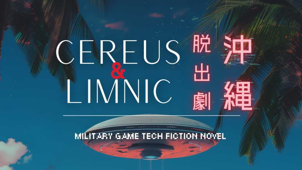
I went back and forth with the font. At first I had a funky alien one that (while fitting) was somewhat difficult to read. So I ditched it for a more futuristic blocky one. The aliencraft tells the story enough.
The neon effect was a perfect contrast for the evening sky. The only thing that remained was the glitch effect to make it pop.
Selecting the title translation
I put a lot of thought into translating the subtitle. While in English the phrase “Escape from Okinawa” has a fairly straight forward meaning, possibilities in Japanese can be… complicated heh.
The first question to ask was: what type of escape are we talkin’ about?
Is it a gradual, slow exit from something like an undesirable job?
Or a sudden flight from danger? Neutral, grammatical, or dramatic (and many in between) those were the options.
Given I’d always pictured this story as more of a thriller, compared to the slow burn of my first novel you know I had to go with dramatic.
That’s how I landed on 沖縄脱出劇 (Okinawa Dasshuttsugeki)
脱出 – escape
劇 – drama
So the title technically translates to: “Cereus & Limnic: Okinawa Escape Drama”
Not bad.
There’s also another advantage to this selection. The Japanese reading for the character “劇” is “geki” which is also the reading for the character “撃”. It means “attack”.
This was a bonus! When someone hears the name they might think “escape the attack”. That’s the power of the Japanese language.
English heading redone
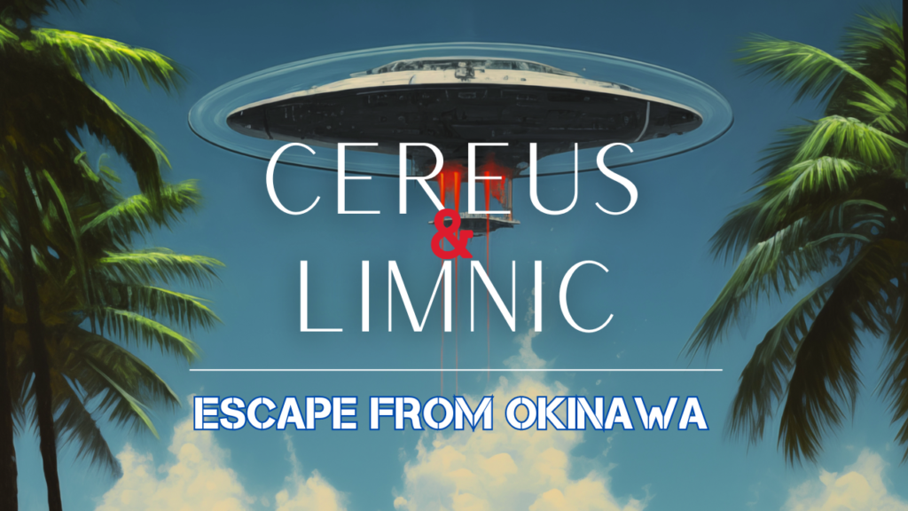
Decided to update the English logo to match themes with the Japanese one.
The result is something that stands out a little more.
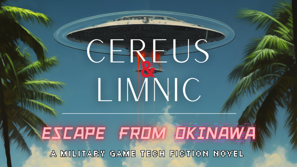
OLD:
NEW:
Both the English and Japanese version share the reddish-pink neon hue in the subtitle. I also added a different glitch effect behind “Okinawa” as in the Japanese version.
I went with Canva’s “SCR-N FIVE” font to invoke a nostalgic feeling of old video games. I’m not sure I like it, but it’ll do for now.
These graphics are important assets. They’ll be critical to drawing outsiders into the project.
I’m especially curious to see the reaction to the Japanese cover (if there’s any). I referenced all the Japanese novels I’ve seen while living in Japan, while maintaining continuity to connect it to the English title. I think it’s good. Great even.
But it’ll be up to Japanese readers to decide what they think.
What do you think?
Travel the Military game-tech fiction universe
日本語で
私は日本語が大好きだ。
その理由のひとつは、その多様性にある。絵文字を面白い方法でスタイル化することで、よりダイナミックなタイトルを作ることができる。
セレウス&リムニックの日本語版表紙は、そのようなデザインにした: Escape From Okinawa』(CL:EFO)の日本語版カバーもそうした。
フォントは何度も変更した。最初は、ファンキーなエイリアンのようなものを使っていたんだけど、(しっくりきたものの)やや読みにくかった。だから、それをやめて、もっと未来的なブロック体にしてみた。エイリアン・クラフトはストーリーを十分に物語っている。
ネオンの効果は夕暮れの空には完璧なコントラストだった。残ったのは、ポップにするためのグリッチ効果だけだった。
タイトルの翻訳を選ぶ
サブタイトルの翻訳にはかなり気を使った。英語では “Escape from Okinawa”(沖縄からの脱出)というフレーズは非常にわかりやすい意味を持つが、日本語の可能性は…複雑だ。
最初の疑問は、どのようなタイプの脱出なのか、ということだった。
好ましくない仕事から徐々に、ゆっくりと抜け出すことなのか?
それとも突然危険から逃れるのか?中立的、文法的、ドラマチック(そしてその中間の多く)、これらの選択肢があった。
この物語をスリラーとして描いていたことを考えると、私の処女作のスローバーンに比べれば、ドラマチックに行くしかないのはわかるだろう。
こうして私は『沖縄脱出劇』にたどり着いた。
脱出 – escape
劇 – drama
タイトルを厳密に訳すとこうなる: 「セレウス&リムニック: 沖縄脱出劇」である。
悪くない。
このセレクトにはもうひとつ利点がある。劇」は「げき」と読む。つまり「攻撃」という意味だ。
これはボーナスだった!この名前を聞いた人は「攻撃から逃れる」と思うかもしれない。日本語の力だ。
英語の見出しを作り直す
日本語のロゴとテーマを合わせるために、英語のロゴを更新することにした。
結果、少し目立つものになった。
古い:
新しい:
英語版も日本語版も、字幕の赤ピンクのネオンカラーは共通だ。また、日本語版とは異なるグリッチ効果を「沖縄」の後ろに追加した。
Canvaの “SCR-N FIVE “フォントを使い、昔のビデオゲームのようなノスタルジックな感覚を呼び起こした。気に入るかどうかはわからないが、今のところはこれで十分だ。
これらのグラフィックは重要な資産だ。外部の人をこのプロジェクトに引き込むために重要なものになるだろう。
特に(もしあれば)日本の表紙に対する反応が気になる。日本に住んでいる間に見てきた日本の小説をすべて参考にしつつ、英語のタイトルとつながるように連続性を保った。いいと思う。素晴らしいとさえ思う。
でも、どう思うかは日本の読者次第だ。
どう思う?